Friday, 11 May 2012

My Comments on my own Photography


Overall I think that all of my photos have good and bad points, I don’t think any of them are perfect but none of them are really bad. I think that you can see from the beginning of my blog to where it is now that I have improved, weather its to do with the lighting, the composition or how I have edited it in Photoshop. I have included some photos that i am proud of this year also as examples.

I think that my strengths within photography are:
Putting the photo together, getting all the components within the photo to complement or to enhance each other.
Being able to edit the photos to quite a high standard.
Learning more about my camera and what it can do as through out this course I have used my own camera so it has helped enhance my ability to use my camera.

I think that my weaknesses would be:
Not knowing the terminology as well as I could but I know that it takes time.
I think I sometimes get stuck using certain types of effects; I would like to expand on this.

Through out this course I think that I have developed many skills within the photography and the technological side. With in photography I feel that I am now able to compose a photo to a high standard no matter weather it is a portrait, macro, landscape or for a advert. I now have an understanding of different terminology, I still need to look at my glossary from time to time but I know that I’ll get there eventually. I think I have also learned to put my opinions aside, when it comes to clients and going with what the client wants rather then going with your opinion, such as I’m doing the photography for my mums sweet shop and its more to what she wants her photos to show then what I think may work. When it comes to the technological side of it I know that I am defiantly still learning but I am now understanding that a shutter is the part of the camera that covers the lens and controls how much light is passed through and that aperture is a opening within the camera lens which is where the light passes through. I now have an understanding that can only improve.


How I intend to develop these skills is to really keep practicing and trying out new angles with the camera and playing around with the settings on both the camera and on programs such as adobe. I want to add more of my photos to my portfolio and to get a professionals opinion at some stage in the future.  


I don’t really have any photographers that inspire me, yet that is but I do have many graphic designers that inspire me when it comes to the layout, their use of colour, how much detail there is or how little, the use of angles and lighting and also how you show emotion within the work getting the viewer to see what emotion you wanted them to see. I am more into the editing part of photography how you can manipulate and change a photo just by a few clicks.

I think my photos have met my expectations, as I didn’t really have any to start off with, this is because I had never really done any professional like photography before only really the holiday photos sort of thing. But now it has really opened my eyes I really do think now before I take a photo it’s really cool. So I guess now my expectations are to improve on what I have achieved to far and to enhance my skills.  
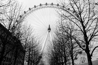


How my photos compare to professional photography, I think my photos are of a high quality but I still have a way to go when it come to the professional standard. I believe that I am on the right track to getting up to the professional standard but seeing as I only really started photography this year I’m happy with the standard of my work.  

Friday, 4 May 2012

Evaluation - Subject Terminology

Here are some words that we have used over the past year and their meanings:

Shutter: the shutter is the part of the camera that covers the lens. it is the part of the camera that controls how much light is to pass through and for what length of time.

Aperture: this is a opening within the camera lens, a space where light can pass through, it opens and contracts to let certain amounts of light in.

JPEG: A jpeg is a file format that you can save your work as. It is one of the most common ways to save your work as because most computers can view these files, it also makes it easier to upload it to the internet.

Composition: Is the arrangement of the visual elements, how the photo is put together, why you want things a particular way.

White Balance: is the process of removing un realistic colour, making the person look natural or  un natural.

Landscape: A landscape image is the opposite to macro this focuses on the bigger picture of your overall surrounding rather then just on one particular thing. genuinely landscape is pictures of countryside, nature e.g. hills, mountains and trees.

Macro: A macro image focuses on the smaller objects such as insects or flowers, showing of their detail and making them look bigger then what they actually are. In a macro shot it only focuses on one particular thing unlike in a landscape photo it focuses on many things.

Portrait: A portrait image focuses on the face of a person or animal, the actual focus of the photo is normally the eyes.

Cropping: cutting out particular parts of the image that you may or may not like.

Contrast: Makes the object stand out more and genuinely makes it look unrealistic this is by changing the colour or lighting slightly.

Sepia: This is a colour tone that is genuinely pale brown/grey that makes the image look older.

Diffusing Light: This light is softer light, natural defusers of light include things such as clouds. a man made defuser is something like lampshades.

Hard Light: makes the image look brighter and gives it more of a contrast unlike soft light which gives you more of a shadow.

Three Point Lighting: having three sources of light focusing on one object taking away all shadow.

Photo Journalism: This is capturing a image to do with a real event  present in the news at the time. It could be of a natural disaster, a war or even a celebration.

Juxtaposition: This is when two opposite people, events or objects are in the same image that you wouldn't normally see together.

Representation: This is how something is presented or portrayed it can be by what it means or by how it looks.

Connotation: This is how the audience interoperate the image.

Friday, 20 April 2012

Assignment Three

My Product Photography

I think the layout of this product worked but my camera went slightly out of focus.

I like this layout too as its how the product would be presented if i wanted to sell it. 

I think this photo the light was wrong on the product and its slightly blurred.

I think this photo shows plenty of detail to the product and works well.

On this one two there is plenty of detail though i think it could of been framed better.

On this one i think the lighting and framing was right.

The framing is right but it has gone out of focus.

The layout on this one works well.

i like this one a lot, it has plenty of detail and the layout is good.

i like this one a lot, it has plenty of detail and the layout is good.

i like how its shadowed on this one.

I think the layout works well on this one.

I think the layout works well on this one.

On this one i think the lighting works very well.

Assignment Three

My Professional Photographer - Michael Jones


http://www.michaeljonesphotostudio.com/#a=0&at=0&mi=1&pt=0&pi=1&s=0&p=-1


Michael Jones is a professional advertising and commercial photographer in portland oregon. He started his photography at a young age while he was still in school when he took a photography class. he studied photography in college and became a photo assistant on the west cost. He then went on to start his own studio in portland, oregon and has been shooting product, portrait and fashion photography ever since.

 Because of copy right i cant get any of his work as examples but please click on the link and look at his jewelry photography.

what i like about his work is the fact that its so simple, he works with the product the angle and the lighting that all and it works so well.

Assignment Three

Product Photography


What is product photography?

Product photography is one area of focus for commercial photographers. Other areas include: Life-style photography, food photography, architectural photography and portraiture.

Commercial probably is often defined as any photography where the photographer is paid for taking and possibly Photoshop and retouching images.
The commercial photographic world usually refers to advertising photography. That is photography made to illustrate and usually sell a service or product.

These images are generally done with an advertising agency, design firm or with an in-house corporate design team using either traditional film and developing techniques or digital cameras with images that can be directly imported into computers for use in designs and layouts.

My Product Photography
The product that I am using is jewelry I wish to be able to use my photos in different types of advertising such as: in magazines, on billboards, in jewelry shops and their magazines. The locations that my shots would be in would be in places such as shopping centers in local shops, in places to do with what I am advertising. 

My Considerations
When it comes to the equipment i would need it would be quite simple, a few lights in a studio, i would need a few models but because its more focused on things such as the hands, ears, neck because its jewelry, they wouldn't need to be overly dressed up and also because its focused and detailed we would need a high quality macro sort of camera to catch all the detail of the jewelry.

Ethical and Moral Considerations - ASA Guidelines

ASA rules are that:
It must not be misleading – not to deceive or lie about what they are selling; the advert must stick to the facts of what they are selling.

It must not be harmful or offensive – adverts are not allowed to use harmful expressions such as using stereotypes.

Sales Promotions – The advert must be accurate with what they say. They must not promote a sub product.

Direct marketing – Adverts must not pressure the public into buying.

I dont think that my product has any problem here because its not really aimed at a partcular audience so its not going to be pressuring them and you get what you see so its not going to be misleading and because its jewlery i dont see how it could be harmful or offensive 


Friday, 3 February 2012

Evaluation


During this assignment we have concentrated on the practical side of photography.
as you can see from my blog there are all different types of photography.

The Rule of Third and the use of lines
Macro
Portrait
Lighting – Hard and soft
White balance
Image Manipulation

Over all I think my photos succeed in portraying and fitting the particular type of photography, but I know that some of them could be improved in the future but I know that this is down to practices, knowing your camera and a steady hand.

Examples of framing


Examples of image manipulation


Examples of white balance

What is white balance?
It all boils down to the concept of color temperature. Color temperature is a way of measuring the quality of a light source. It is based on the ratio of the amount of blue light to the amount of red light, and the green light is ignored. The unit for measuring this ratio is in degree Kelvin (K). A light with higher color temperature (i.e., larger Kelvin value) has "more" blue lights than a light with lower color temperature (i.e., smaller Kelvin value). Thus, a cooler (resp., warmer) light has a higher (resp., lower) color temperature.

The following table shows the color temperature of some light sources


Light Sources Color Temperature in K
Clear Blue Sky 10,000 to 15,000
Overcast Sky 6,000 to 8,000
Noon Sun and Clear Sky 6,500
Sunlight Average 5,400 to 6,000
Electronic Flash 5,400 to 6,000
Household Lighting 2,500 to 3,000
200-watt Bulb 2,980
100-watt Bulb 2,900
75-watt Bulb 2,820
60-watt Bulb 2,800
40-watt Bulb 2,650
Candle Flame 1,200 to 1,500


Friday, 13 January 2012

Examples of Lighting - Hard and Soft Light


Uses of soft light
  • Soft light use is popular in cinematography and film. 
  • Cast shadow-less light
  • Fill lighting. Soft light can reduce shadows without creating additional shadows.
  • Make a subject appear more beautiful or youthful through making wrinkles less visible.
  • Supplement the lighting from practicals. This technique is used to perform "motivated" lighting, where all light in the scene appears to come from practical light sources in the scene. Soft light does not cast shadows that would be a giveaway of a supplementary light source.
Hard light
Hard light sources cast shadows whose appearance of the shadow depends on the lighting instrument. For example, fresnel lights can be focused such that their shadows can be "cut" with crisp shadows. That is, the shadows produced will have 'harder' edges with less transition between illumination and shadow. The focused light will produce harder-edged shadows. Focusing a fresnel makes the rays of emitted light more parallel. The parallelism of these rays determines the quality of the shadows. For shadows with no transitional edge/gradient, a point light source is required.

The two images here show how diffusion of light happens differently. Basically, diffusion of light is a way of creating softer light so an image has less shadows.
 In the first image, the subject is stood outside in harsh light. There is no diffusion, hence the dark shadowing from the person. This is different in the second image; it was taken inside with a overhead light. This had a lampshade over it, which diffuses the light and makes very little shadow.


Here you can see the light changing.